Making Waymo more accessible through better riding tips
Copy before
Ride Controls
Each Waymo vehicle has a button pod located on the ceiling between the front headrests. It contains four buttons that can be used to control the vehicle and get help.
Braille labels are found on the button pod, above each of the four buttons.
Copy after
Rider Controls
To start your ride, pull over, or get help, use the buttons on the ceiling between the front headrests.
Braille labels are found above each of the 4 buttons to help you identify them.
What I did
I worked with PM, UX, and engineering on copy to give riders better tips on how to use the car, with a focus on writing for accessibility. I rewrote engineering and PMs original in-app copy to make it more human and simple to follow.
Changes I made and why:
- Adjusted to remove some jargon like “button pod” and “vehicle”
- Why: Makes language more user friendly. Also for consistency across the product. We don't use "button pod" in the onboarding training or elsewhere in the app.
- Flipped some sentence structures to put the context before the action the user takes
- Why: Easier for users to skim. Also answers what the customer wants to know upfront.
- Reworded and shortened some sentences
- Why: Shorter sentences look less intimidating to read on mobile
- Made it clearer what a user can do with the in-car buttons
- Ensured photos used in the app design had appropriate alt text so they could be read by screen readers
- Per Google UX writing guidelines:
- Edited headers to sentence case
- Changed numbers to numerals (4 vs. four)
Improved transparency & action in error message
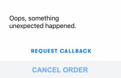
Copy before

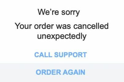
Copy after

What I did
After receiving an unclear and frustrating error message through the Waymo app, I worked with Product Operations and Engineering to improve the messaging.
Message updates
- Removed "Oops"
- Why: Too insincere when we may have significantly inconvenienced a customer
- Added apology since our system cancelled the order
- Why: This is our error. We owe the user an apology
- Explained up front that order is cancelled
- Why: The user wants to know right away why they are reading a pop-up message
Button updates
- Changed button to "ORDER AGAIN"
- Why: Gives the user an easy way to try again
- Updated to "CALL SUPPORT"
- Why: "REQUEST CALLBACK" sounds too robotic, like language you wouldn't use in real conversation. Also doesn't explain who you would be talking to, so updated to "CALL SUPPORT"
*Based on real error message copy update I wrote with some contexts changed for confidentiality purposes. Parts redacted and replaced for confidentiality are in blue.
